Designer Q&A: Sue Timney
Renowned designer Sue Timney’s work ranges from commercial and residential interior architecture to product design for interiors and fashion. The Sue_Timney design practice undertakes specialist interior and product projects, while Timney Fowler creates collections of fabric, wallpaper and lifestyle accessories.
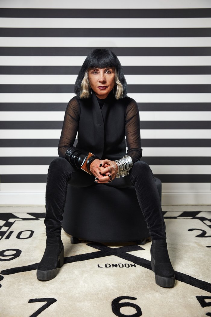
What inspired you to become a designer?
I was an artist from the minute I could do anything. Ever since I learned how to write, I wanted to draw more. It was the thing I was best at doing, and my strength from the beginning.
Your exotic classicism is celebrated. Tell us about it.
I would hope it’s slightly difficult to define, to be honest. I don’t want to feel restrained by having to work in one genre. I think it’s about not being fixed in one place, and yet still having a style. Generally, it’s about a mix of things that stand out, have some strength, and have a voice. They don’t necessarily fit into one time period or genre, but it works.
You were president of the BIID, and are currently a director. What does the BIID represent for you?
It is the leading professional institution, and the one and only body that covers interior design in depth.
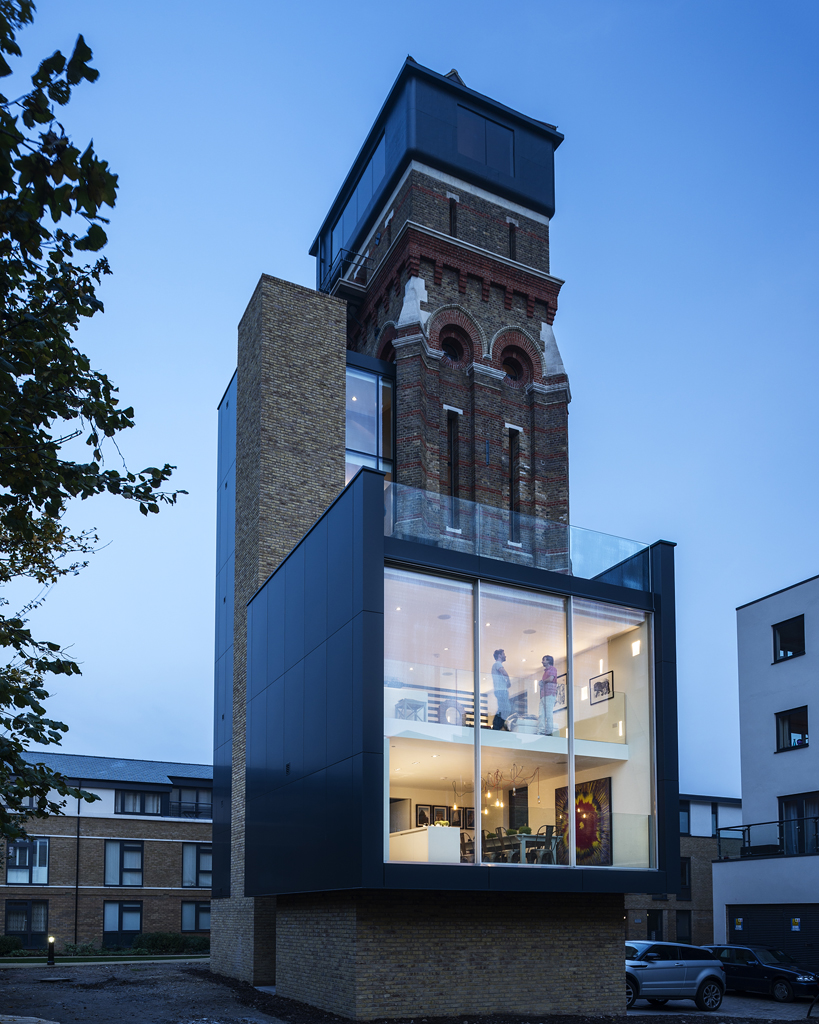
The Water Tower in Kennington, London, was a huge project, and the Grand Designs programme in which it featured nominated for a BAFTA. How did you come up with the interior design concept for this 100ft tall Grade II listed Victorian tower?
It was a wonderful conundrum. It was never a residential property, and one of the least likely that one might imagine, with a small footprint in a very tall building. It had retained a lot of its industrial content in terms of the architecture, and I wanted to respect that.
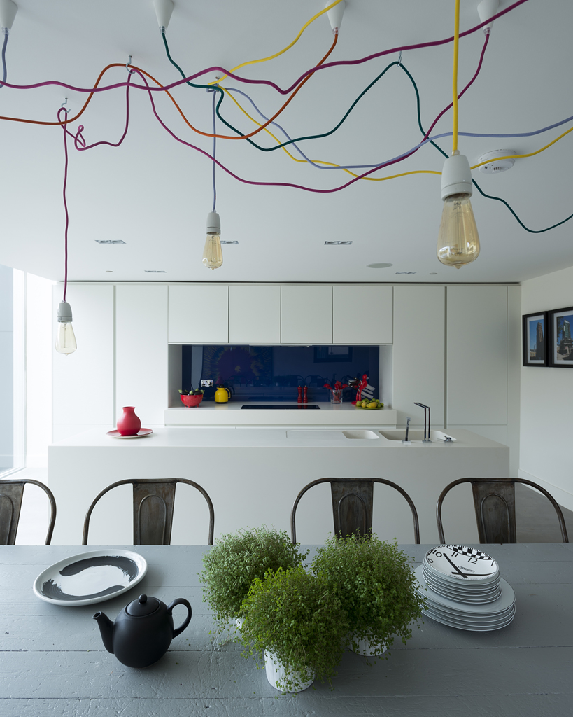
What were the main challenges of this unique home – and how did you approach them?
I worked with the owners, and the things they felt they wanted, and made a story that respected the surroundings, letting the building lead.
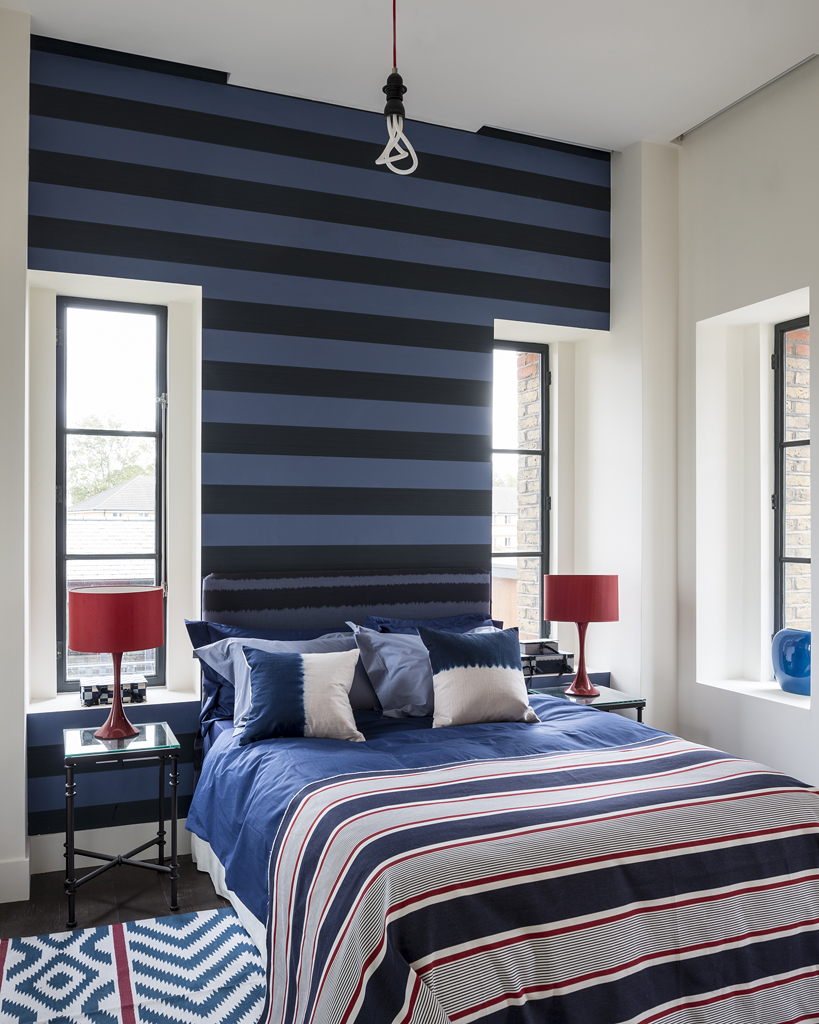
How did the scheme of tones of blue come about?
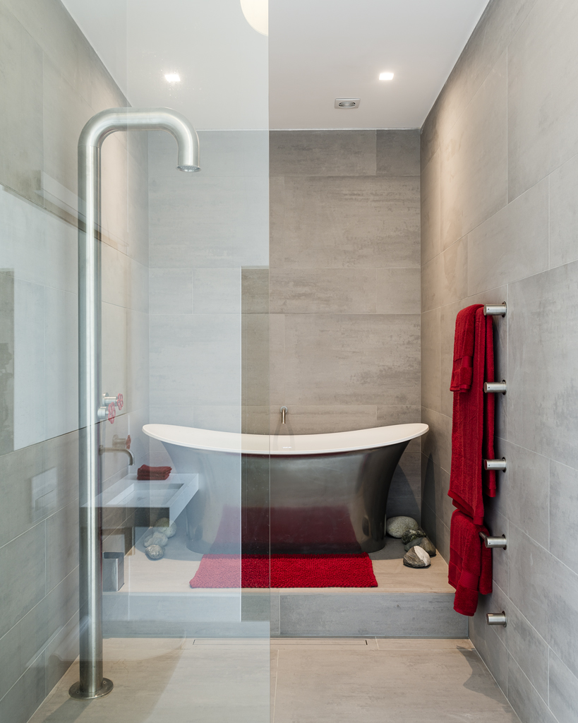
It seemed that with its being a water tower, I should applaud that idea. Colour led me and blue appeared an obvious way to go. I didn’t want every floor to look the same, and started with deep blue at lower levels, getting lighter and lighter at each level until eventually becoming white as you get to the tank room right at the top. There are also accents of hot fire red now and then.
As well as your interior design practice, you work on product and branding projects. Can you tell us about what’s coming up for Timney Fowler and your recent work with the Sir John Soane’s Museum?
Timney Fowler is launching a new collection at Focus in September, and at the showroom in Chelsea Harbour with new fabric, wallpaper and lifestyle accessories, and we welcome everyone to the showroom on the third floor at Chelsea Harbour.
The Sir John Soane’s is my favourite museum. One of my more recent projects for them is around the Hogarth exhibition*, for which I designed product and branding based around A Rake’s Progress and other images.
*Hogarth: Place and Progress takes place at the Sir John Soane’s Museum from 9 October 2019 to 5 January 2020.
Take a look at our designer Q&A with Staffan Tollgård
Rowena Vaughan Reflects On The Impact Of The Building Safety Act
Submit nominations for the BIID Merit Award 2023 until Friday 21st April.
The second in a two part series going behind the scenes of designer created spaces at industry shows
Explore the latest, member-exclusive, templates designed to make your life easier.
The first in a two part series going behind the scenes of designer created spaces at industry shows
You can shape the future of regulation in the furniture industry. Learn how here.

