How to make sure your website works for your business

To bring new customers to your business, an effective website is essential. But what should be included? Use these tips to ensure yours is attracting the enquiries you want
A website is a must-have for an interior design practice. It’s a reflection of your professionalism and gives you the chance to showcase projects, and demonstrate your experience and credentials. It also enables potential clients to get in contact easily.
Bear in mind that even if individuals and businesses are recommended to you by those for whom you’ve completed projects previously, they’ll almost certainly want to see and read more about your practice. Check you’re not lacking anything on your site with this guide.
What does the home page of an interior designer’s website need?
- When visitors arrive on your site, you haven’t got long to capture their attention so they’ll stay there. A prominent statement about what you do is therefore vital. It needs to let visitors know whether you take on residential and/or commercial work, the scale of your work, and any specialisms you might have It’s a good idea to include where you work or, if you take on projects nationwide or internationally, say so.
- Keep your home page statement brief, though. Site visitors should be able to pick out words such as ‘commercial’, ‘UK wide' and so on with a quick scan, so don't let them get lost in a wordy paragraph..
- The lead image you use is equally vital. Just like what you say about your practice, it allows website visitors to identify a potential fit and encourages them to stay on there for more. It doesn’t need to be a full roomset – and using a section of a space can be extremely effective, showing off the detail of a scheme while still representing the overall style of the room.
Include previous interior design projects
- A page of projects is a must-have element of the site. Divide it into different types of work if this applicable to your practice, so visitors don’t lose patience trying to find projects like theirs.
- Professional photography is important, but it should be accompanied by a brief description of the project. Where it took place (area and home or commercial building type), as well as a summary of the extent of the work will assist site visitors in understanding if you could take on their project.
Detail interior design services and specialisms
- Because the introduction to your practice on the home page is brief, the ‘about’ page is the opportunity to give more detail. It’s the place to say in which regions you work (for example, London, or a county, or outside the UK); the types of building you work on (hotels, offices etc); which services you offer; and list all of your specialisms.
- While a paragraph or two written in full sentences can be a good introduction, don’t hesitate to include lists and/or bullet points which make text much easier to read on screen.
Add a page about your interior design credentials
- If potential customers like what they see and read on your site, they’ll also want to know about you and any team around you. A page that’s about you can include where you studied and show you’re a member of the BIID.
- Don’t make this page dry, though. Let your personality and passion for interior design shine through to make a deeper connection with potential clients.
Make contacting you easy
- When visitors like what they’ve seen on your site, taking the next step needs to be simple. A phone number, email address and contact form on the contact page will suit different preferences, so include all if you are able. Links to any social pages are also a good idea for visitors who want to see more of your work.
- Projects on your site might be appealing to journalists looking for case studies for features, or they may want to ask you for expert advice to quote in an article. If you like the idea, add contact details specifically referring to press or media enquiries. These may be yours, a separate email address you set up, or the details of a PR agency if you employ one.
How to write the words for your website
- Writing the copy for the site yourself? To bring organic (that is, not paid for) traffic to your site, think about the words people might use in their search, and include them. For example, if a potential clients is searching for: interior designer, residential, north London, those words on your home page, about page, and in project descriptions will all help get them to you.
- Avoid long sentences and paragraphs when you’re writing as these make reading on screen harder.
- If any of your pages include long blocks of copy, break these up with subheads, too, to make them kinder on the reader. They’re also another way to include the search words that are important to your practice.
Put yourself in a site visitor’s shoes when it comes to on-screen reading and you’ll avoid a surfeit of information – without missing out anything vital. It’s a tactic that works when reviewing the whole of your whole site, too, ensuring you include everything that will help lead new clients straight to your practice.
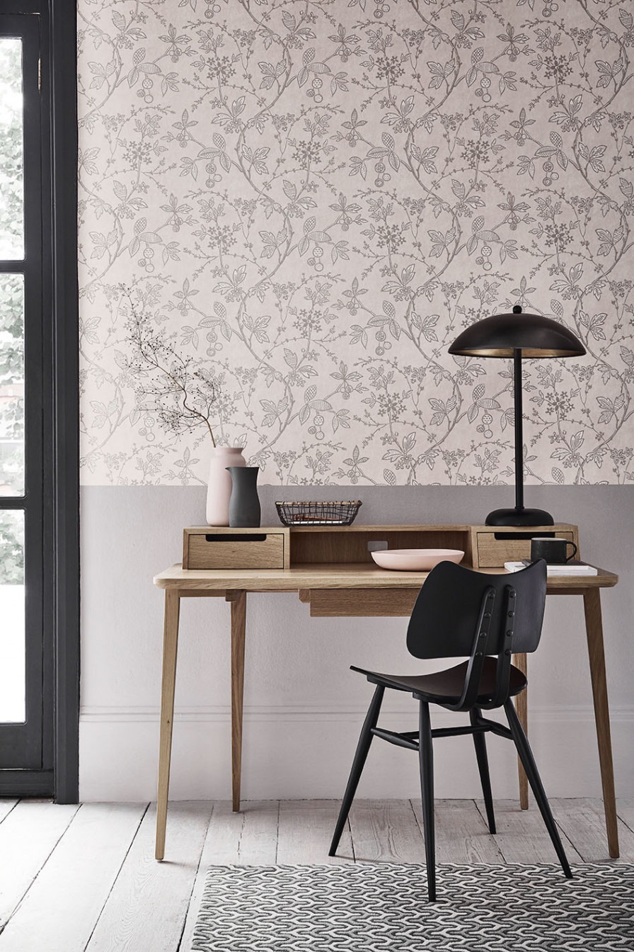
Image from www.littlegreene.com
Arts University Plymouth wins the BIID Student Design Challenge 2024.
BIID has welcomed a range of new members and Industry Partners over the last three months
Katherine Elworthy reflects on 15 years Chief Operating Officer of the BIID
The BIID are delighted to welcome GP & J Baker as Platinum Partner
With so much to do at Decorex, we spoke to Ana Caetano Alves for advice on how to make the most of it
We are delighted to welcome the new BIID President for the 2024 - 2025 term, Angela Bardino


