How to design interiors for people with visual impairment
Explore how simple principles can make your designs more inclusive.
Juan Sandiego is an Interior Advisor and Well-being Coach with 15 years of experience in Primary Care and Member of the BIID Diversity & Inclusion Committee. He believes you don’t need specialist knowledge to create beautiful, functional spaces for people with visual impairment. All you need to know is some simple design principles to make your indoor environment more inclusive. Here is Juan's guidance on how to approach this challenge.
It all begins with the “Triple B” rule to make design features bigger, brighter, and bolder. To learn how, check these easy, practical tips to make your designs—and your business—more inclusive for people with visual impairment.
What is visual impairment?
People with visual impairment experience difficulty in their everyday lives due to sight loss. Even though the prevalence of sight loss increases with age, you may encounter people with visual impairment of all ages: from children to working-age adults.
The degree and type of sight loss can vary, and not everyone experiences the same issues. According to the RNIB, it’s estimated there are over two million people living with sight loss in the UK, and this figure is expected to double by 2050.
How can interior designers help?
Interior designers hold the key to create safe, functional spaces without compromising on style. Look beyond the health and safety regulations in the UK in order to cater to those with sight loss. From preparing a cup of tea in the kitchen to using a computer in the home office. Design is your tool to make someone’s life easier.
Design with the Triple B rule in mind
The easy-to-remember Triple B rule states that room features should be bigger, brighter, and bolder. These guidelines apply to small fixtures, like door handles, and larger room elements, such as staircases. Let’s look into the three key considerations you should remember.
Bigger
The larger the object in the room, the bigger its image on the retina and thus making it easier to see. This applies to everybody, but it’s helpful for people with visual impairment, as it makes the most of their remaining vision.
In practical terms, making room features bigger means opting for furniture, fixtures and equipment that doesn’t have small functional elements. For example, European-style light switches are preferred over traditional UK ones because of the bigger size of the switch area. You can also play with relative size by placing the sofa closer to the TV and making it easier to see.
Brighter
Visual performance increases in bright light. Most people with visual impairment will benefit from this. However, note that too much light can lead to glare. Therefore, making spaces brighter requires a combination of efficient artificial light and adjustable window treatments to control natural light.
Spaces that need particular care include high-traffic areas, such as hallways and staircases, and rooms where concentration tasks are performed. For example, under-cabinet lighting in the kitchen is ideal to ensure safe food preparation. Similarly, a wardrobe with built-in light will help the client differentiate clothes. The RNIB provides further guidance on the benefits of enhanced lighing.
Bolder
Making room features bolder refers to contrast, rather than style. High colour contrast makes design elements stand out against the background. This is useful when moving around a space and to identify potential obstacles, such as door frames, walls, rugs and furniture.
Choosing different colours is not enough. Ensure their brightness difference creates high colour contrast. Consider the elements of your design that you need to highlight based on safety and practicality. For example, dark green walls with a white door, light grey carpet with navy skirting boards, or black handles with off-white kitchen cabinets.
Working with Clients
Following these simple rule can help when starting a project with a client who has a visual impairment.
- Carry out an enhanced client brief to ensure the specific visual needs of your client are considered, including optimal light levels
- Use digital formats on a tablet to show concept boards and presentations to your client. A PDF file can be magnified without quality loss and they can read the text via screen reader software if needed.
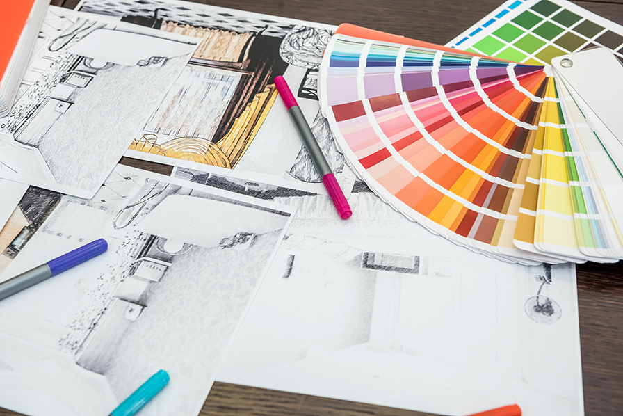
- Hand drawings and sketches made with a fineliner can be hard to see, use a thicker pen instead.
Conclusion
Designing for people with visual impairment requires no specialist knowledge. By conducting a thorough brief and considering the Triple B rule (bigger, brighter and bolder), you will ensure the specific needs of your clients are met. Creativity and resourceful thinking will allow you to deliver results that are both inclusive and stylish.

Explore the latest, member-exclusive, templates designed to make your life easier.
NALA | The Art Matchmaker is Platinum Partner with the BIID
Prize winners for ‘Digital’, 'Hybrid' and ‘Hand Drawn’ for this inaugural event have been awarded

The first in our new, quickfire "Do You Know..." series. Giving you quick insight to crucial topics.

Read about the latest updates in the formation of an interior design apprenticeship.

Be part of the Governments next consultation impacting the built environment industry.