Styling for photography: Expert know-how for great results
Discover the essentials of styling rooms for photography so you can create fabulous images of your projects
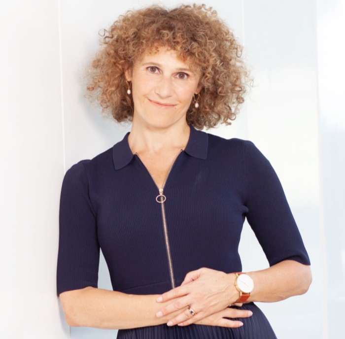
Styling rooms for photography whether you’re featuring completed projects on your website or so they can be used in interiors magazines and online has particular requirements. We asked interiors journalist, author, and lecturer Judith Wilson, whose work has appeared in publications including House & Garden, Homes & Gardens, The English Home, Living etc and Country Homes & Interiors to provide insight into the ways to create rooms that look great on page and screen.
What does styling a room/home for photography require that's different from executing a design?
Styling a room for photography is all about creating instant visual appeal, as opposed to the practical elements of comfort, space management and longevity required when executing a design. A well-styled photo of, say, a drawing room, needs to invite the onlooker in, imbue the room with a palpable sense of ambience, and suggest a narrative about who lives there and what is happening in it. Styling is visual storytelling. You need to harness appropriate accessories and props, flowers, great lighting, furniture arrangement, and the correct camera angle to suit the shot (rather than the room in real life) so that the final visual gives the best possible version of that room.
What are the biggest mistakes you see people making when styling for photography?
A few common ones are:
- Putting small props such as mugs or bowls on a large surface, such as kitchen island unit, which don't fill the space, and look minuscule in a pulled-back shot. Scale up!
- Not paying attention to shelving – gaps on shelves show up more in a photo, therefore take time to fill them appropriately, constantly checking the shot until the items look well-spaced and natural.
- Using flowers that are too small or stems that are too short in relation to the size of the room/table they’re on/height of the ceiling. Never be afraid to scale up blooms or foliage. And cut and arrange them whilst looking through the camera, not before.
- Putting an unopened bottle of wine on a dining table or glasses or a jug without evidence of drinks. You’re creating lifestyle in this shot so decant the wine into a pretty decanter, fill jugs and glasses with water etc, as if someone is about to sit down to eat.
- By contrast, sometimes I see a stylist has tried to put too many props and items in to suggest lifestyle, ie a coffee cup, an open newspaper, shoes strewn on the floor, a jacket over a chair. Just pick one or two.
Why are both details and whole room shots important?
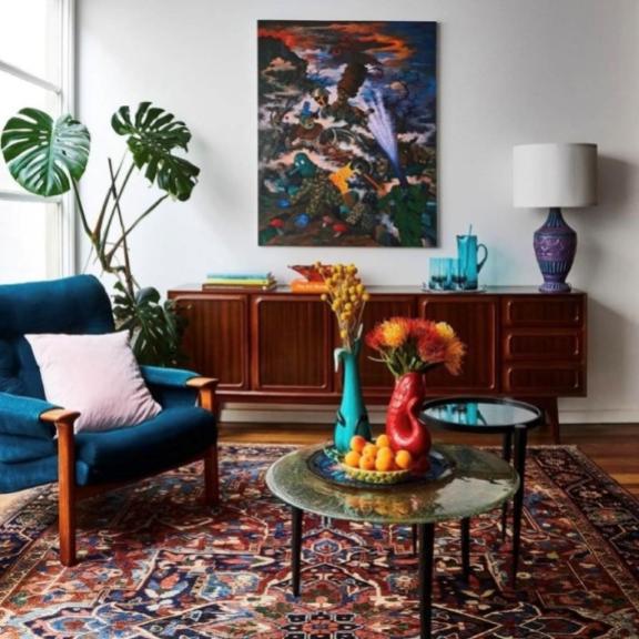
It’s always crucial to have a whole room shot for ‘information’ purposes. Readers of magazines or consumers of websites love to see how a whole room works, so in general you'll find editors want those large shots, even if ultimately they chose a detail of a room and make it a page.
With a large, double-aspect sitting room, say, or an open-plan space with a variety of zones, ie kitchen/dining area/sitting area, it’s particularly important to provide sufficient pulled-back shots so that it’s possible to see how all these zones fit together. Detail shots are often more fun to style because they are effectively small still-life studies.
Personally, I also like to have what I call a mid-shot, which is between a detail shot, and a whole room shot. These feel particularly intimate, perhaps just an armchair by a fire with a cropped-through fire surround, or one half of a double bed with one side table.
The more choice you can create on a shoot, the better. A whole room shot also shows how a beautifully composed decorative scheme works overall, whereas a detail shot can be used to highlight a pretty hand-painted wallpaper, exquisite tiles, a quirky contrast piping on a sofa etc that won’t show up in a full room image.
What do you need to think about to style in a way that is suitable for the magazines/websites you would like to appear in?
Get a very clear idea in your head about who is living in the room or property – whether that’s the ‘real’ owner, or an imagined one. What will this person be eating in the kitchen/dining room (pick appropriate food props), are they neat or messy (which will dictate whether, for example, the bedroom is exquisitely tidy or the bed lightly rumpled), and is this a family home or one for a couple (for the former, you might wish to add in some toys/bikes in the hall and for the latter to have more sophisticated props)?
Always bring more flowers and greenery than you think you will need – many magazines like to have foliage of some kind in every room, which eats up blooms pretty quickly, and don’t fall into the trap of using just one or two vases in each room, this will be detected when all the room shots are put together.
‘Relaxed living’ should in general be your watchword – a lightly squished cushion, as if someone has been sitting in a chair, a glass of water on a side table, perhaps a window open for a summery shot, and a roaring fire for a winter shot.
If you're keen to be in a particular magazine, it pays dividends to spend time scrutinising their past issues to really hone in on the sort of styling they like. Some magazines, for example, like to have people in the shots, and others don’t.
Also, match your styling ‘style’ to the interior design. A chic, tailored vibe requires quite minimal styling, whereas a country cottage will suit rumpled throws, just-cut-from-the-garden foliage, and ramshackle books on a shelf.
Learn more from Judith and earn CPD hours with BIID course styling interiors for photoshoots.
Explore the latest, member-exclusive, templates designed to make your life easier.
NALA | The Art Matchmaker is Platinum Partner with the BIID
Designer insight into commercial and residential design
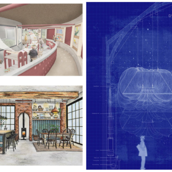
Prize winners for ‘Digital’, 'Hybrid' and ‘Hand Drawn’ for this inaugural event have been awarded

The first in our new, quickfire "Do You Know..." series. Giving you quick insight to crucial topics.
Read about the latest updates in the formation of an interior design apprenticeship.