Designer Q&A: Sophie Ashby
Renowned designer and BIID member Sophie Ashby tells us about her ethos and shares her experience of starting her journey.
Founder and creative director of Studio Ashby, Sophie Ashby undertakes projects for private clients both in and outside London as well as for commercial clients, designing interiors for some of the capital’s most well-known developments of recent years. After a BA in History of Art at the University of Leeds, she studied Interior Design at Parsons School of Design in New York.
We asked Sophie about her career, and she gave us an insight into her recent project at the Hexagon Apartments in London’s Holborn.

Photograph: Jon Gorrigan
What inspired you to become a designer?
As is the case with so many interior designers, I moved a lot growing up. With a South African mother and a British father, my childhood was spent living for stints in London, Stellenbosch (South Africa) and Devon and, with 14 or so moves, I got used to ‘doing up’ my bedroom.
I’ve always been fascinated by the idea of home and how much it can mean to people. Arranging my bedroom furniture, making my bed, and putting my posters up as a kid transformed a new and unfamiliar space back into my sanctuary. I love houses and am fascinated by how people live, what they surround themselves with, and what makes a place a home.
You set up your own studio in 2014, at an early point in your career. Why did you make the leap, and what advice would you give young designers who want to follow in your footsteps?
Studio Ashby was born as soon as I got my first private client. I was lucky that within a couple of weeks, one client quickly became three and things have continued to grow steadily from there. I started my business from a laptop, with no savings or investment, working from cafés. Studio Ashby has grown to become a team of 14 and we have a lovely studio in Notting Hill.
I feel very lucky with the journey I have had, but it can be really testing at times and there are unknowns that can come along and disrupt even the best laid plans, like Brexit or staffing problems, so I think you have to work on yourself to become someone who is pragmatic, calm and able to take a step back and get perspective on a tricky situation – otherwise you will combust! The stress of running a business is not to be underestimated.
Your aim is to bring authenticity to each of your projects. Can you tell us something about how this is created?
We have worked hard to build strong relationships with artisans and craftsmen, and spending time expanding on our extensive resources and continual foraging play an integral role in developing each project. I believe it’s the stories behind the stuff that makes an interior interesting – and authentic.
You’re a member of BIID. What does your membership bring you?
It’s really important because it’s the only accreditation we have in this country and it’s something a prospective client or collaborator can understand and believe in. It’s a mark of professionalism and credibility.
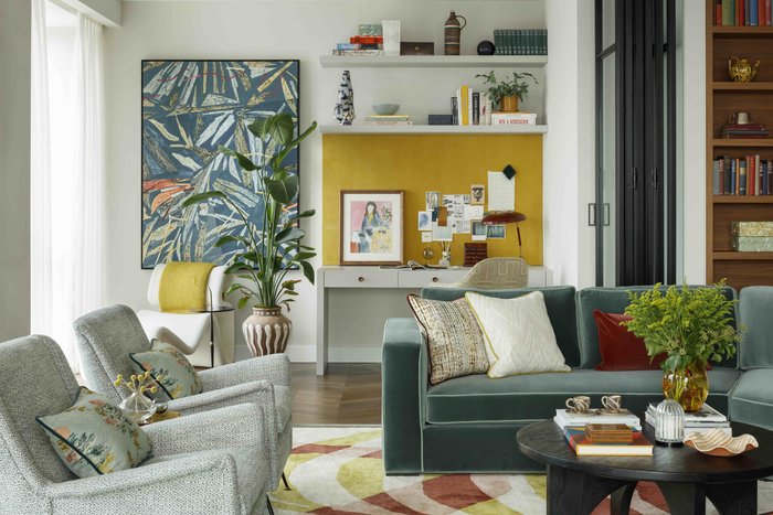
Photograph: Philip Durrant
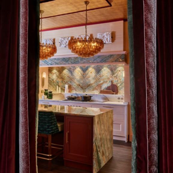
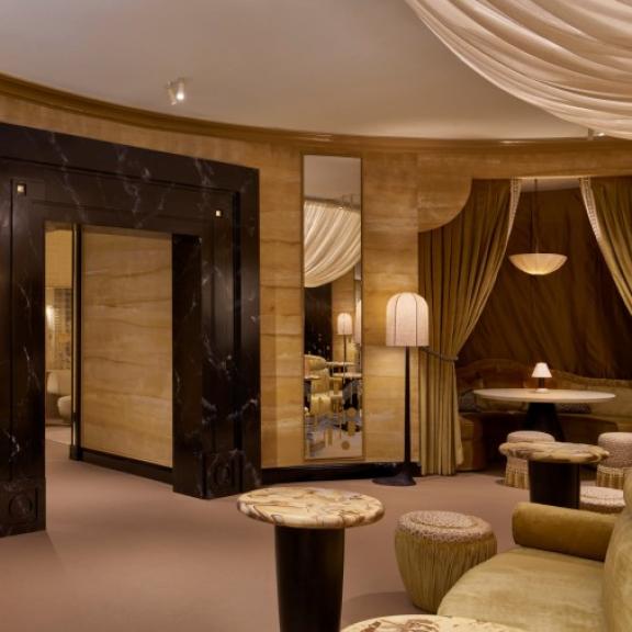
Can you take us on a tour of this contemporary interior at the Hexagon Apartments in Holborn? What was your starting point for this design?
For our colour palette we were inspired by taking tones from the local area, including the art and fabrics produced by the Bloomsbury group. The furniture and fabric references are also influenced by local architecture, landmarks and abstract art. We set out to create a space that is full of character and personality, with careful layering of objects, furniture, lighting and art that will truly allow one’s imagination to take you there as the owner.
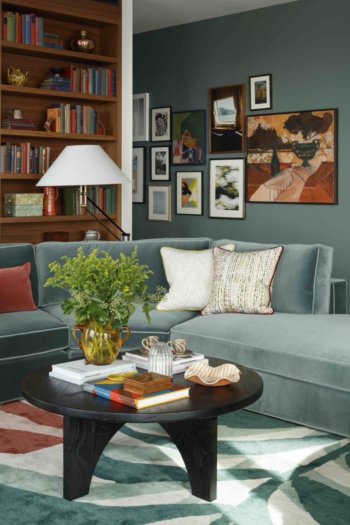
Photograph: Philip Durrant
Art is a vital part of your inspiration and process. Can you tell us about its presence within this project?
We always start with the art, so great art has become synonymous with our studio. We commissioned Fredrik Åkum to create a painting in this study, making it a focal point that can be seen from many areas of the apartment. Based in Gothenburg, Fredrik creates work capturing fleeting moments from Sweden’s short summers, which he translates into beautiful fluid paintings that drift between observed reality and daydreaming.
Another piece is by Belgium-based artist Stephanie Maeseele – her paintings depict snapshots of people, their belongings and their personal environments. There is also an abstract terracotta earthenware sculpture, ‘Standing Women’, by London-based ceramicist and illustrator Aude Van Ryn. Aude studied illustration at Central Saint Martins and the Royal College of Art.
Overall, the selected pieces communicate with one another about beauty, nature and community, much like the Bloomsbury group’s philosophies.
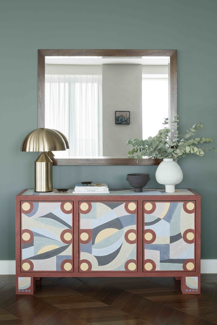
Photograph: Philip Durrant
Can you tell us about this striking piece, and your approach to selecting furniture for your projects?
We commissioned paint and furniture specialist Rupert Bevan to finish the bespoke cabinet in the reception area. This piece captures the expressive painting style of the Bloomsbury group, with visible and textured brush strokes. The collective was well known to treat every surface within their homes as their art canvas, instilling vibrant colour and pattern.
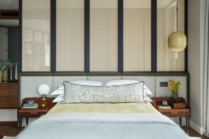
Photograph: Philip Durrant
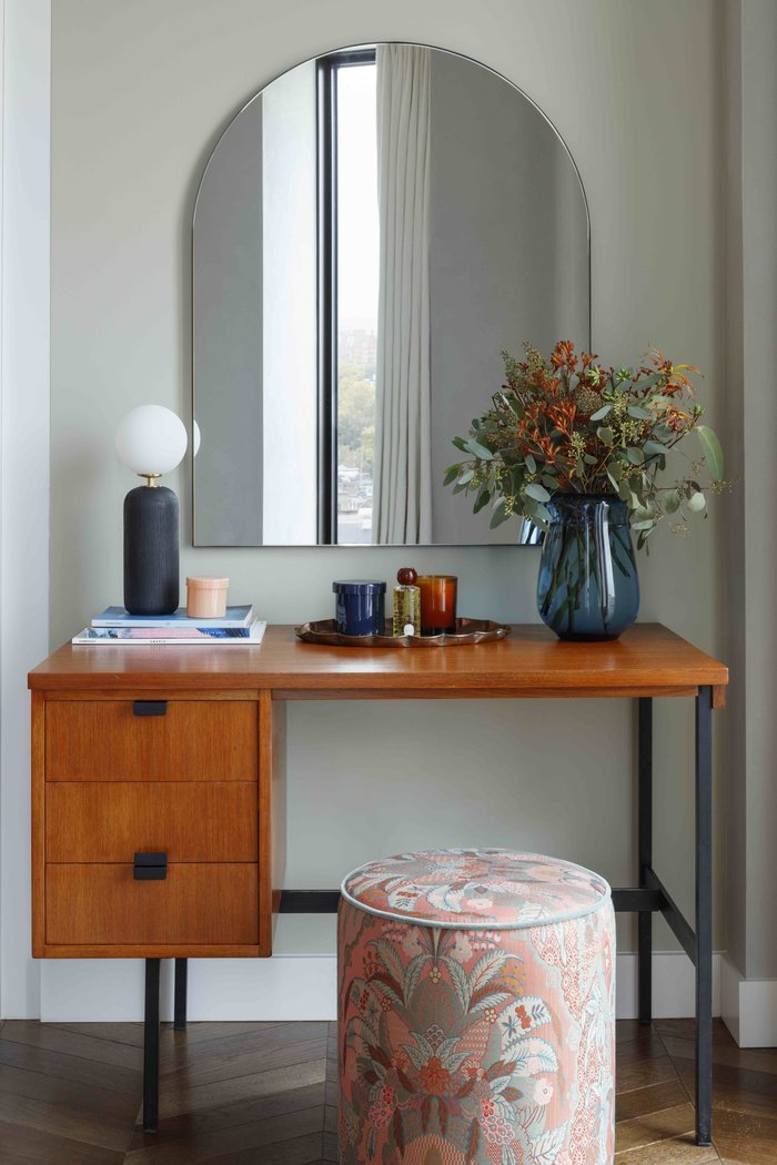
You like to use a natural palette of materials and textures. Can you talk to us about those you’ve used in this bedroom?
We usually start with the headboard fabric and build the scheme out from there. You can go one of two ways, something calm and quiet and then go to town on the cushions, artwork and rug, or go bold with the headboard fabric, and keep everything else more subdued.
Generally, there is a balance of loud and quiet in our designs as ultimately, in a bedroom, I think you want the feeling of chaos-free calm. In this scape we wanted to evoke that feeling of a real oasis in the city – which we created by using quiet blues.
Photograph: Philip Durrant
Antiques, including modernist furniture, are one of your loves. How did that passion influence the design of this apartment?
With the Hexagon apartment we had the Bloomsbury set in mind, who were leading figures in art appreciation and were pioneers of the Modernist movement. It therefore seemed inevitable that the design scheme would be sympathetic to the aesthetic of the group and then mix in contemporary elements to create something that is ultimately timeless and refreshing. When mixing the old with the new, one often makes the other seem more beautiful.
Photograph: Philip Durrant
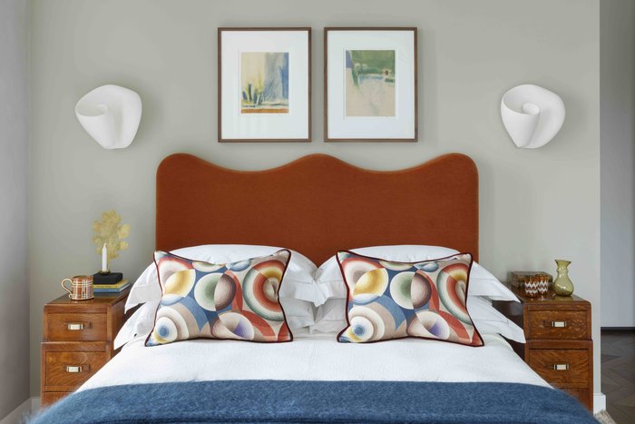
This bedroom features appealing curves. Can you let us know a little about the scheme?
Our aim was to soften the angular lines of the Hexagon tower to create a cosy living environment. Waves played an integral part in this room’s design with the curves in the headboard echoed in the Sonia Delaunay-inspired cushion covers by Pierre Frey bringing another Modernist reference to the apartment.
Take a look at our designer Q&As with Sue Timney and Staffan Tollgård
NALA | The Art Matchmaker is Platinum Partner with the BIID
Rowena Vaughan Reflects On The Impact Of The Building Safety Act
Submit nominations for the BIID Merit Award 2023 until Friday 21st April.
The second in a two part series going behind the scenes of designer created spaces at industry shows
Explore the latest, member-exclusive, templates designed to make your life easier.
The first in a two part series going behind the scenes of designer created spaces at industry shows
